


Every Page Should Have a Purpose
A beautiful website can make a great first impression — but what happens next?
If your visitors aren't sure where to click, what to do, or how to contact you, even the most visually impressive website can fall short.
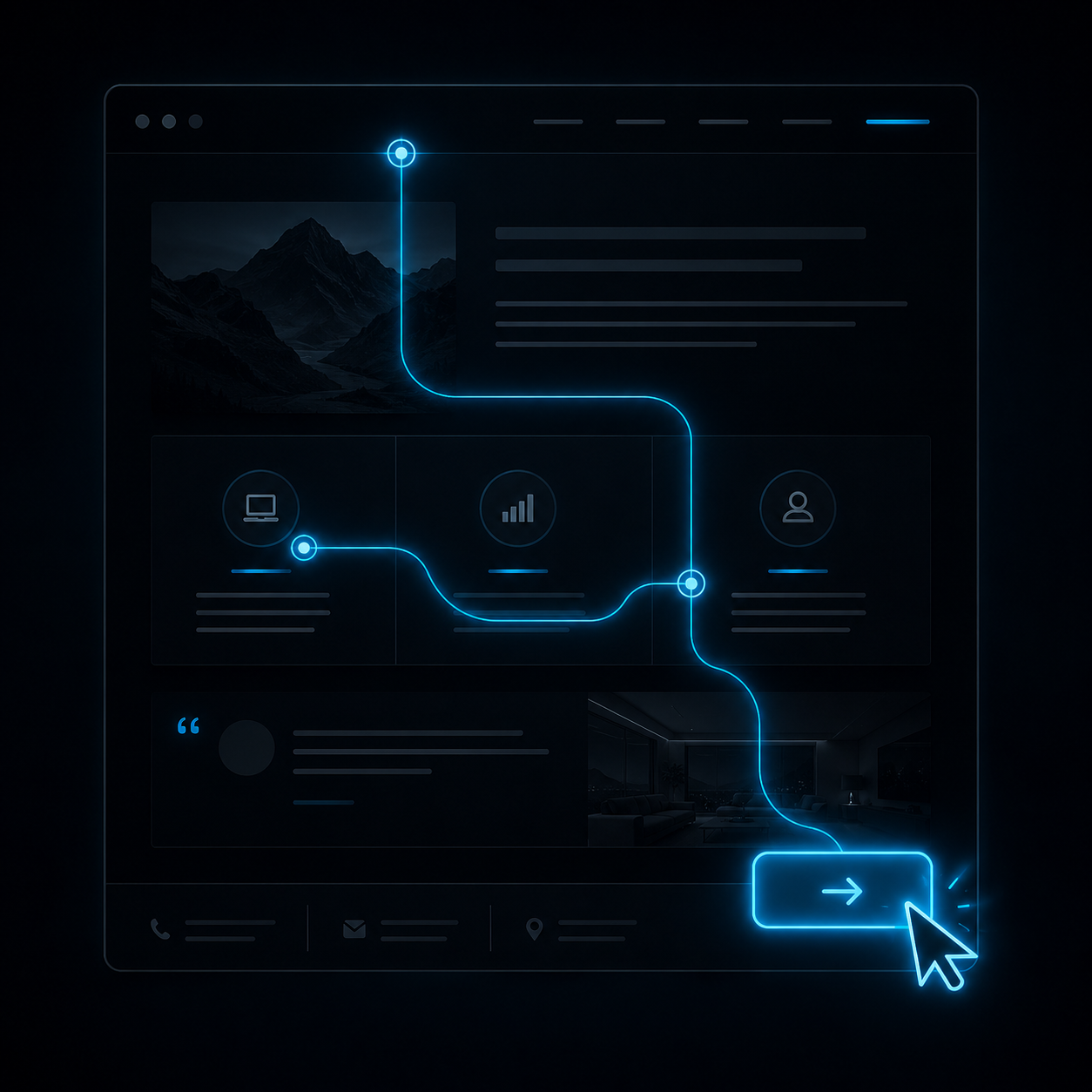
Every page on your website should have a purpose. More importantly, every page should guide visitors toward taking the next step.
What Is a Call-to-Action?
A
call-to-action (CTA) is simply an invitation for your visitor to do something.
It could be:
- Request a quote
- Book a consultation
- Contact your team
- Browse your services
- Shop your products
- Download a guide
- Subscribe to your newsletter
Without a clear call-to-action, visitors are left wondering what to do next — and many will simply leave.
Every Page Should Move the Journey Forward
Think of your website as a conversation.
- Your homepage introduces your business
- Your service pages answer questions
- Your portfolio builds confidence
- Your testimonials establish trust
Every page has a role to play, but each one should also encourage visitors to take another step. Whether that's exploring another service, filling out a contact form, or requesting a quote, the journey shouldn't end when they reach the bottom of the page.
Keep It Clear, Not Complicated
One of the biggest mistakes businesses make is overwhelming visitors with too many choices.
Instead of presenting five different buttons, focus on just one or two primary goals for each page.
Ask yourself:
- What do I want visitors to do after reading this page?
- Is that action obvious?
- Can they complete it in just a few clicks?
Clear direction creates confidence, and confident visitors are much more likely to become customers.
Calls-to-Action Should Feel Natural
A good CTA doesn't need to be loud or pushy. It simply appears at the right moment.
For example:
- After explaining a service: Request a Quote
- After showcasing a portfolio: View More Projects
- At the end of a blog: Book a Consult or Read Another Article
When the next step feels like a natural continuation of the page, visitors are more likely to take it.
The Takeaway
Your website isn't just there to be admired — it's there to help your business grow.
Every page should have a reason to exist. Every section should answer a question. And every call-to-action should move visitors one step closer to becoming customers.
If your website looks great but isn't generating the inquiries or conversions you'd hoped for, the issue may not be the design — it may be the direction.
A thoughtful website doesn't just attract visitors... it guides them.
Not sure where your website stands?
Let’s take a look together. We’ll show you what’s working, what’s not, and where the real opportunities are.