


Mobile-First Isn't the Future—It's the Standard
When was the last time you searched for a business on your desktop computer?
If you're like most people, it was probably on your phone.
Whether someone is searching for a restaurant, contractor, retail store, or professional service, their first interaction with your business often happens on a mobile device. If your website isn't optimized for that experience, you may lose a potential customer before they even learn what you offer.
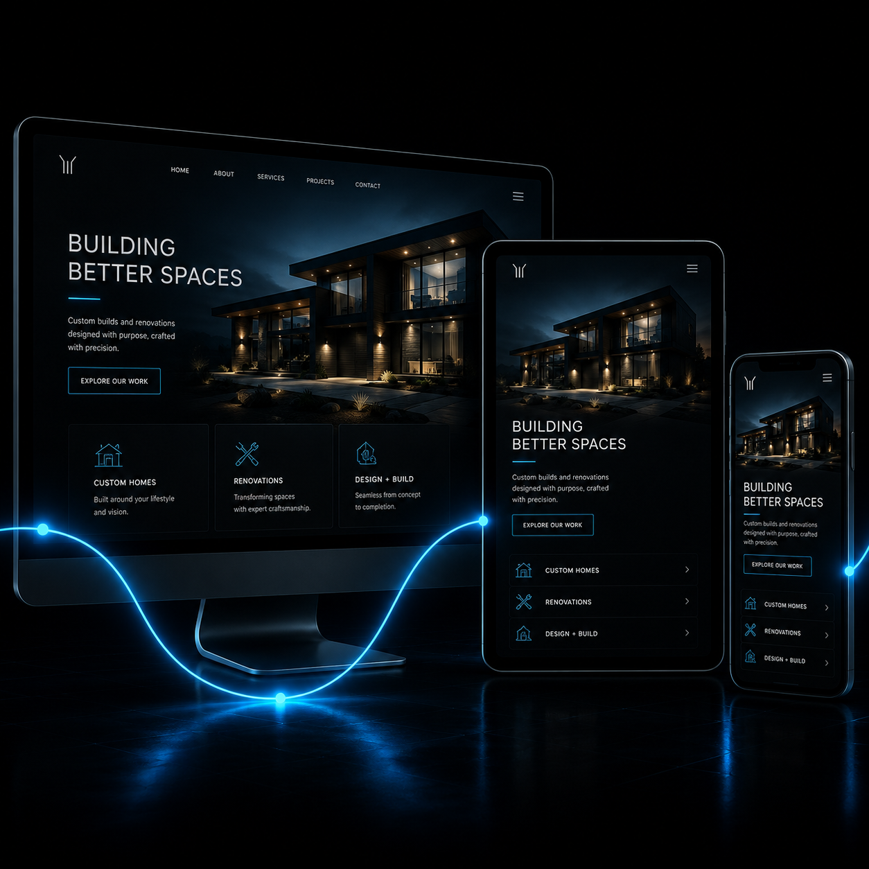
Mobile Usage Continues to Grow
More than 82% of Canadians own a smartphone, and mobile browsing continues to dominate web traffic across nearly every industry.
For many small businesses:
- 75% or more of website visits come from mobile devices
- Mobile users are more likely to contact a business directly
- Google primarily indexes the mobile version of your website first
That means your mobile experience isn't just important for visitors — it's important for search engines too.
Responsive Design Goes Beyond Screen Size
Responsive websites automatically adapt to different devices, but good mobile design is about much more than shrinking content.
A mobile-friendly website should have:
- Easy-to-read text
- Clear navigation
- Buttons large enough to tap comfortably
- Responsive layouts that prevent clipped content
- Fast-loading pages
- Forms that are simple to complete
- Proper spacing between interactive elements
The easier your site is to use, the more likely visitors are to stay — and take action.
Mobile Experience Impacts SEO
Google uses mobile-first indexing, meaning it primarily evaluates the mobile version of your website when determining search rankings.
If your site performs poorly on mobile, it can affect:
- Search visibility
- User engagement
- Bounce rate
- Overall rankings
Every Click Counts
A mobile visitor often has immediate intent. They're looking for answers, directions, pricing, or a way to contact you.
A frustrating experience can send them to your competitor in seconds.
Your website should work wherever your customers are.
Not sure where your website stands?
Let’s take a look together. We’ll show you what’s working, what’s not, and where the real opportunities are.